
When it comes to interior design, color is everything. It influences mood, defines the vibe of a room, and — when used intentionally — can turn a simple space into a statement. Whether you’re redecorating your living room, styling a retail space, or curating the perfect Airbnb aesthetic, choosing the right color palette makes all the difference.
We’ve gathered 5 designer-approved color palettes that go beyond the ordinary — and some expert insight on how to use them to make your space really stand out.
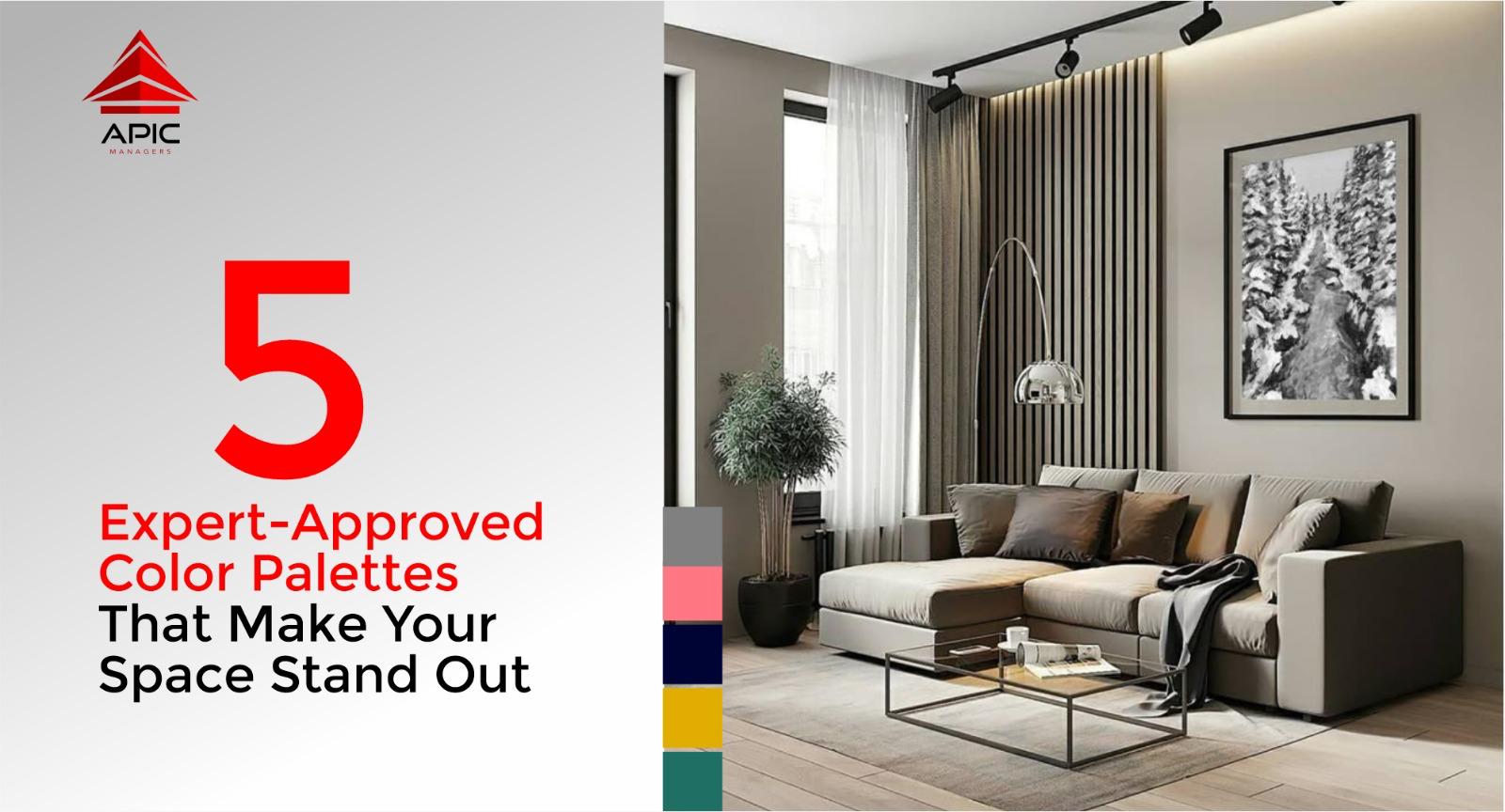
1. Warm Neutrals & Earthy Tones
Colors: Sand, Terracotta, Olive, Taupe, Warm White
This palette is a go-to for creating spaces that feel grounded, calm, and natural. Inspired by the earth, these tones bring warmth without being overwhelming. They also age beautifully — a major win for long-term design.
Where it shines: Living rooms, lounge areas, and spa-inspired bathrooms.
Expert Insight: Layer materials like linen, jute, clay, wood, and soft wool. This palette is all about texture and depth, not just color.
2. Bold Jewel Tones + Soft Neutrals
Colors: Emerald Green, Sapphire Blue, Plum + Champagne, Cream, or Dove Grey
If you want luxury without going full gold-and-marble, this one’s for you. Jewel tones are rich and expressive, and when paired with soft neutrals, they balance boldness with elegance.
Where it shines: Dining areas, home offices, feature walls, boutique hotels.
Expert Insight: Use velvet, brushed metals, or polished wood to enhance the richness. Lighting also matters — warm light brings out the depth of jewel tones.
3. Muted Pastels & Dusty Shades
Colors: Dusty Rose, Sage Green, Dusty Blue, Warm Beige
Pastels don’t have to be sweet. When muted, they become soft, modern, and emotionally calming. These tones work beautifully in light-filled spaces and add subtle color without overpowering.
Where it shines: Bedrooms, nurseries, reading nooks, creative studios.
Expert Insight: Go for matte finishes and minimalist furniture to avoid the palette looking too “cute.” Combine with natural textures like rattan or raw wood.
4. Monochrome with a Metallic Twist
Colors: Black, Charcoal, Dove Grey, Soft White + Brass or Rose Gold Accents
Sleek, bold, and timeless — monochrome interiors make a strong statement. But when you add a metallic twist, they become instantly more luxurious.
Where it shines: Kitchens, bathrooms, galleries, modern apartments.
Expert Insight: Don’t go flat black everywhere. Use varied shades and finishes (matte, gloss, brushed) to keep the look dynamic. Use metallic accents sparingly — handles, frames, or lighting fixtures are enough.
5. Coastal Blues with Crisp Whites
Colors: Navy, Sky Blue, Soft Teal, White, Sand
This palette isn’t just for beach houses. When done right, it brings a fresh, airy sophistication that feels both relaxing and elevated.
Where it shines: Entryways, verandas, bathrooms, or anywhere you want to evoke calm.
Expert Insight: Stick to clean lines and minimal clutter. Use natural light, light woods, and breezy fabrics to complete the coastal feel.
Designing a space that stands out starts with choosing colors that reflect both function and feeling. These expert-approved palettes are versatile, modern, and designed to elevate — whether you’re refreshing one room or reimagining your entire home.
Need help choosing the perfect palette for your next project? Don’t be afraid to test swatches, experiment with lighting, and lean into your personal style. Color is the easiest way to bring your space to life.